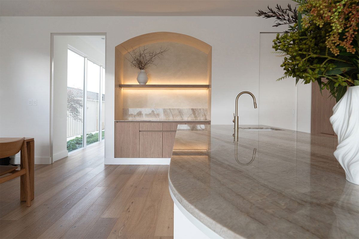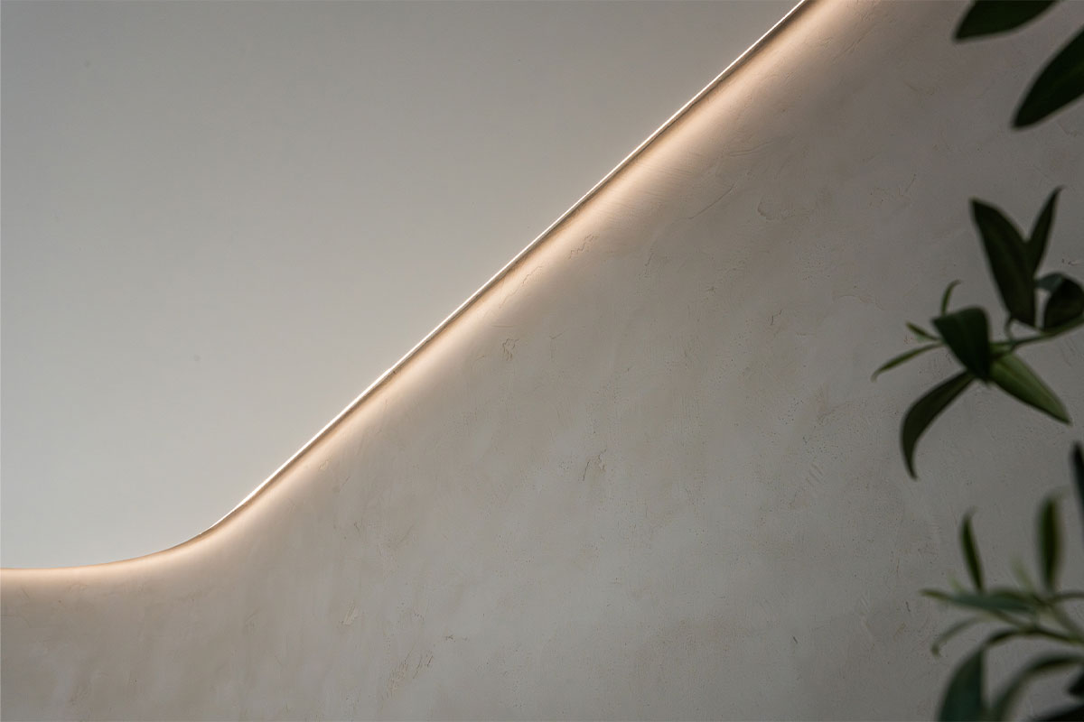

Through-Body
Pigment runs at depth
Custom
Matched to your reference
2 Textures
Smooth or worked
On Site
Sampled in your own light
Our Standard Colour Palette
Microcement colours run through six tonal families: bone and off-white, warm beige, greige, clay, mid grey and charcoal. Pigment runs through the material rather than sitting on it, so the colour holds at depth and wears far better than a surface coating.
Because the pigment runs through the material rather than sitting on top of it, microcement colours behave differently to paint. A scuff does not expose a white substrate underneath, and a spot repair blends because the colour is present all the way through the coat.
In practice, most residential and commercial work sits inside a fairly restrained tonal range, and that restraint is much of the appeal. These are surfaces meant to sit quietly and let the light and the texture do the work.
01
Bone and Off-White
Firstly, the lightest end of the range. It opens up small rooms and reads almost plaster-like under natural light.
02
Warm Beige and Greige
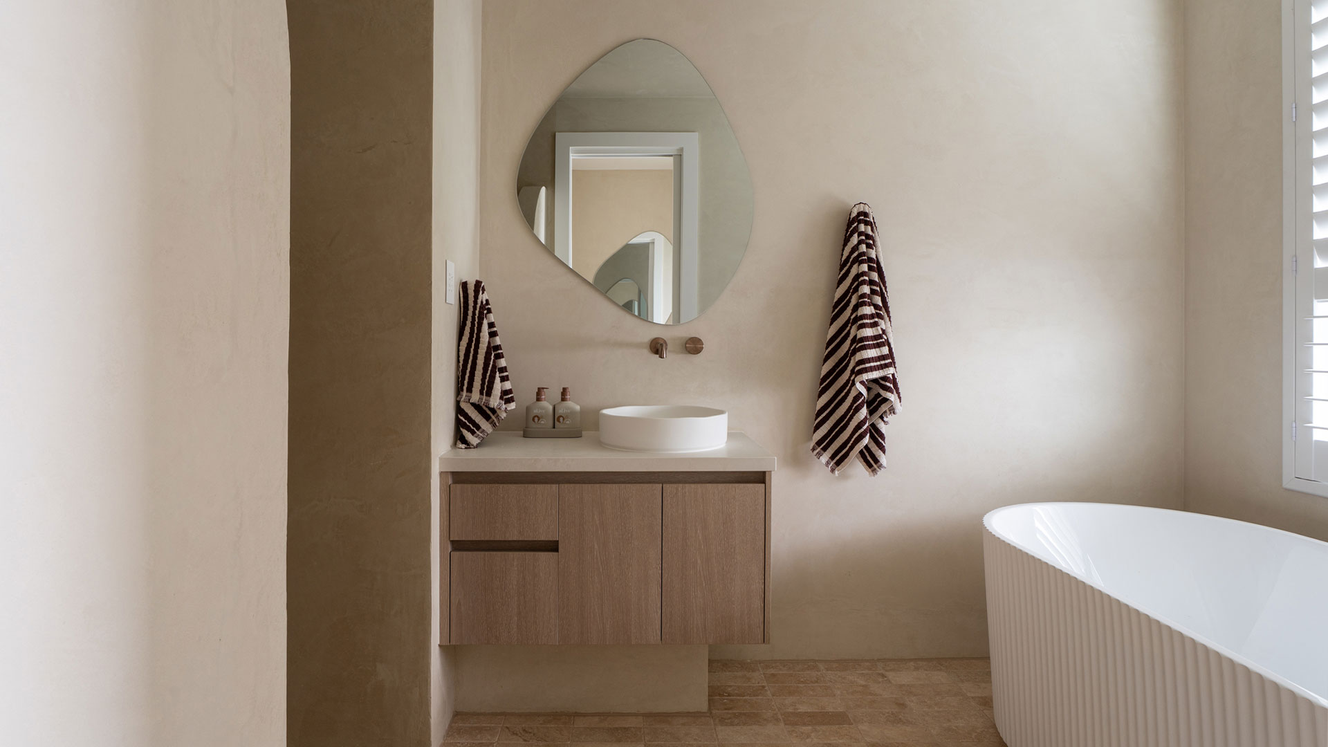
Secondly, the most requested family, because it sits comfortably with timber joinery and brass fittings.
03
Clay and Taupe
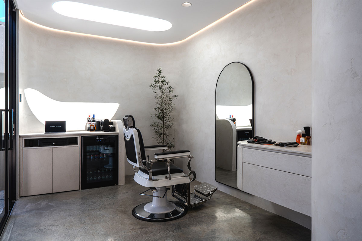
Earthier, with more depth. For example, Harko Studio pairs a clay tone with a skip-trowel texture.
04
Mid Grey to Charcoal
Finally, the concrete-adjacent end. Strong in commercial fit-outs, and also striking on a floor under matte sealer.
Tone shifts noticeably between a matte and a satin sealer, and again between morning and evening light. That is exactly why we never decide a colour from a screen.
Custom Colour Matching
Standard families are a starting point rather than a limit. Indeed, most projects that come through an architect or designer arrive with a reference of some kind.
Matching to a Reference
For instance, a paint chip, a stone sample, a fabric or a specification. We then prepare boards against it and adjust the pigment until it sits right.
Working With the Room
Joinery, stone, tapware and flooring all push a tone one way or another. So we judge the board against those, not in isolation.
Sampled in Your Light
We review boards in the actual space at different times of day, because north-facing and south-facing rooms read the same pigment very differently.
Two honest caveats. First, deep and highly saturated tones sometimes need an additional coat, which affects the quote. And we cannot guarantee an exact match to a printed swatch, because a hand-applied mineral surface carries movement that a flat printed colour does not.
Textured Versus Smooth Finishes
This decision, however, changes a surface more than most people expect. The same pigment can read as calm and architectural or as tactile and hand-made, depending entirely on how the trowel works it.
Step by step
- Smooth trowelled: The quietest option, and therefore a near-uniform plane with only faint hand movement, suited to minimal interiors and large open areas.
- Subtle movement: Light cloud and trowel passes show in raking light. Consequently this is the middle ground, and the most commonly specified for residential work.
- Skip-trowel texture: Pronounced passes and depth, giving a worked, tactile character. The finish used at Harko Studio in a clay tone.
- Fine sanded: A light tooth in the surface for grip underfoot. Generally specified for entries, wet-adjacent floors and commercial spaces.
- Sheen choice: A matte sealer keeps the tone as sampled, whereas a satin sealer lifts the pigment and adds a soft reflection without a wet look.
We sample texture and sheen together, because they interact. For example, a skip-trowel finish under satin sealer reads far busier than the same texture under matte.
Project Showcase Gallery
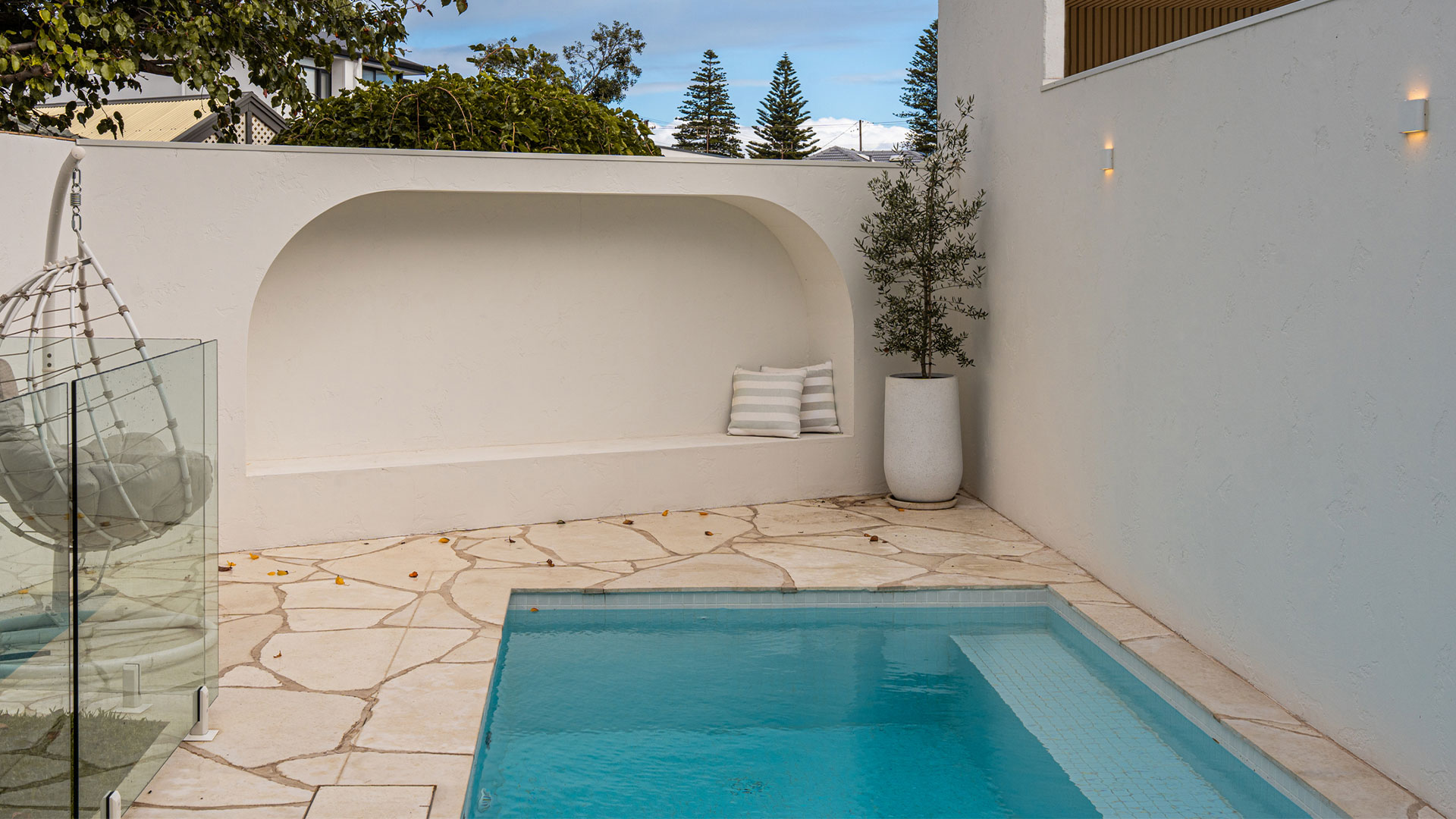
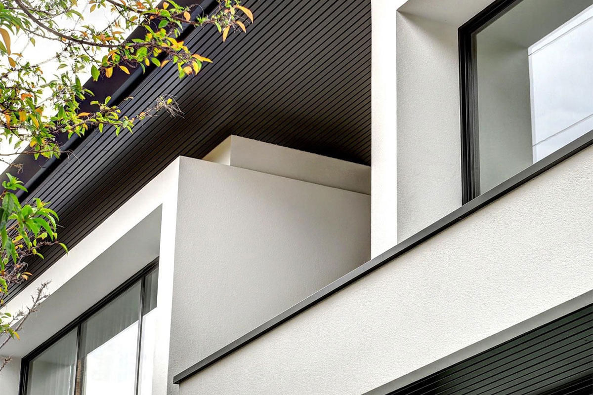
Completed microcement work across Adelaide and South Australia, from private residences to studios. Together they show different points on the tonal and textural range.
01
Harko Studio
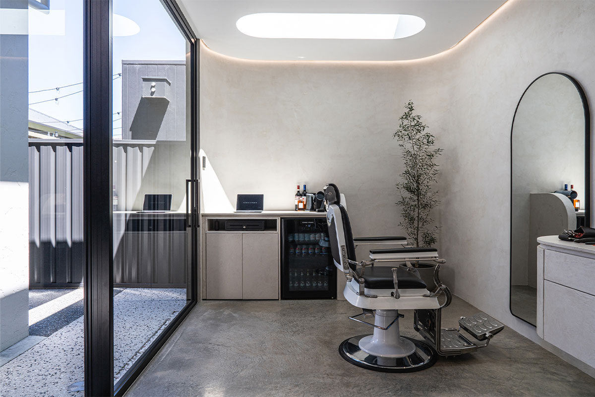
Clay microcement with a skip-trowel texture, in a studio space where the worked surface carries the whole room.
02
Henley Beach
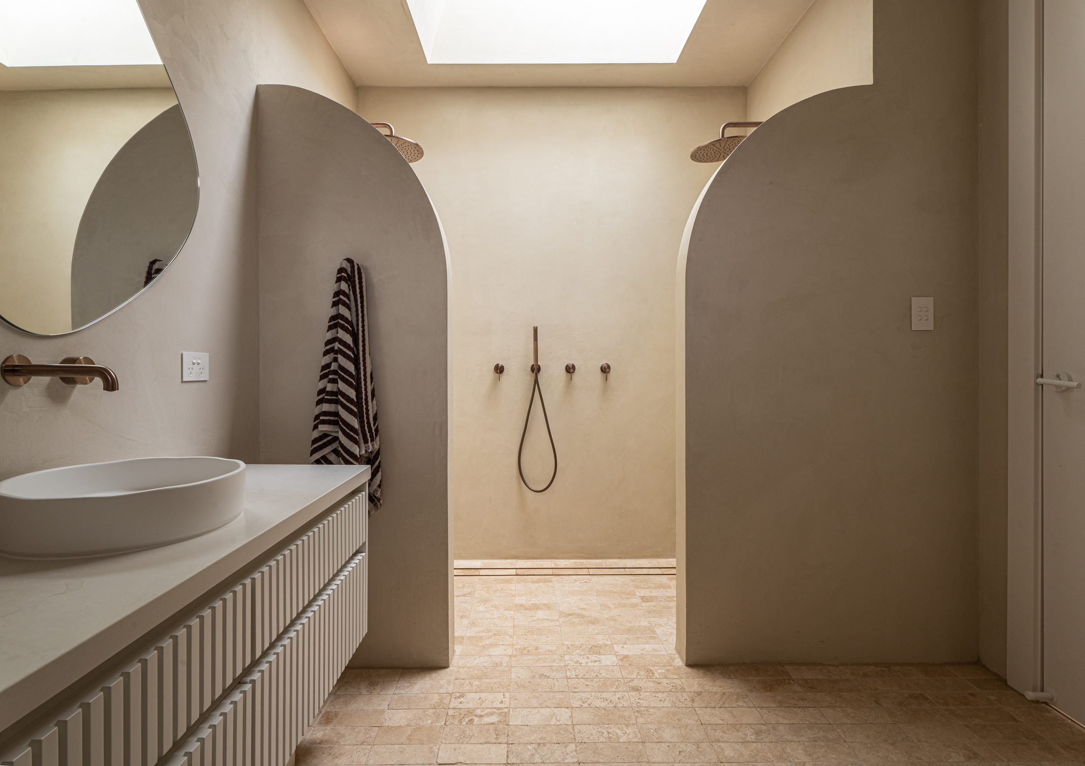
Secondly, a seamless microcement bathroom running floor to wall, with no grout lines and no tile edges.
03
Flinder Park
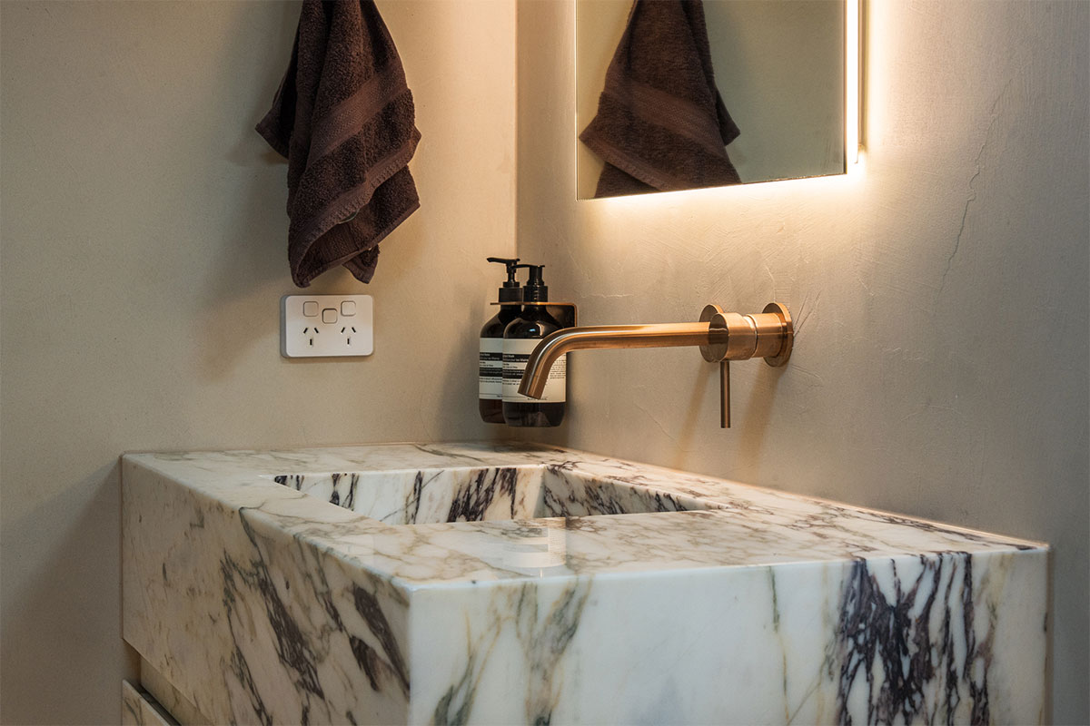
Beige microcement in a bathroom, paired with a viola marble vanity for contrast against the quiet tone.
04
See Them All
Finally, twelve completed projects across residential, restaurant, showroom, studio and healthcare spaces.
Explore the full portfolio on our projects page, or see how each application works on the microcement services, microcement flooring and microcement bathroom pages.
Frequently Asked Questions
Common questions about microcement colours and finishes, answered by our in-house team.
Can microcement match a specific colour?
In most cases yes, or close to it. Pigment runs through the material rather than sitting on it, so matching works differently to paint. We prepare sample boards against your reference and review them on site before committing.
Will the colour be perfectly uniform?
No, and that is the point. Hand application leaves subtle movement and cloud, which is what separates it from a painted surface. The degree of movement is a choice you make at the sampling stage.
Does the colour fade over time?
Mineral pigment dispersed through the material is far more stable than a surface coating. Interior surfaces hold their tone well, and the sealer does most of the work protecting the finish.
Can I see the colour before committing?
Always. We prepare sample boards in your chosen tone and texture and review them in your own space, in the actual light, before booking any work. Nobody commits from a photograph.